

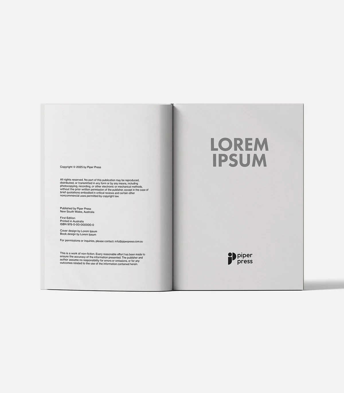
Piper Press Sydney Publishing Rebrand
As part of my design internship with Piper Press, I led a rebrand to refresh the identity of this independent publishing house. The new logo and visual system draw inspiration from the Bauhaus movement, combining bold simplicity with warmth and accessibility. The result is a clean, versatile identity that reflects Piper Press’s vision of bringing artistic and creative histories to life through beautiful, illustrated books.
Logo Concept
The new Piper Press logo takes inspiration from the Bauhaus art movement, known for its bold simplicity and creative spirit. Built on clean, geometric shapes, it reflects a vision of bringing significant artistic and creative histories to life through beautiful, illustrated books.

The Icon
The icon draws from Bauhaus principles, using essential geometric forms to create something both classic and fresh. The circle and semi-circle represent completeness and harmony. The curved rectangle adds a dynamic, contemporary touch. Applying Gestalt theory, these shapes unite to form the distinctive “P” mark — a whole greater than the sum of its parts. This reflects Piper Press’s commitment to creativity, beauty, and accessibility, presented in ways that feel friendly and timeless.


The Colour
Primary colours: Black, Light Grey, and White — a clean foundation that enhances readability and reflects the Bauhaus principle of functional simplicity.
Secondary colours: Orange, Sky Blue, and Parchment — a palette that adds warmth and energy. Orange sparks creativity and energy. Sky Blue brings trust and calm. Parchment nods to traditional bookmaking while keeping things fresh and modern.
Together, these create a welcoming, balanced system that helps Piper Press stand out.

This project gave me the chance to explore design in the context of book publishing and to create an identity system that balances clarity with character.
I learned how to apply design principles like grids and Gestalt theory in a practical way, while also shaping a brand voice that feels contemporary and approachable. It was a valuable experience in bridging creative exploration with functionality.